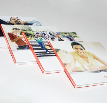
Each client is unique.
Each piece customized.
Each strategy based on a foundation of
real experience and professional expertise.
Play with our portfolio pages and
discover the creative in going barefoot
Case Studies
Web site
One of the most interesting challenges for today's non-profit is the digital environment. each non-profit understands the need to engage donors in a relationship and it makes sense that digital communication would help do that. Communication professionals are well aware of the presence of social media. The success stories of KIVA and Heifer are highlighted at many conferences. But few non-profits have truly developed a digital presence that is engaging and builds relationships with donors.
MEDA is well known for innovative solutions to poverty. Business minded and solution oriented, they came to us to help them build a web site that was cost effective, innovative and engaging. They challenged us in four ways:
- The construction of the site needs to be cost effective and include a strong revenue model.
- Their donors were asking for opportunities to engage the younger generation. In some cases, this meant web savvy 40-year-olds. In other situations, it meant teenagers and college aged students.
- The model had to work within the parameters of their program.
- The site needed to celebrate the effectiveness of microfinance and revolving loans.
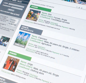
Like Kiva, MEDA is engages in microfinance. But there were certain differences. First of all, MEDA wanted to protect the identity of the entrepreneurs they financed. Secondly, MEDA wanted to be able to invest in growing microfinance opportunities, not just fund loans. Finally, many of the microfinance institutions were in remote areas with unreliable access to online support.
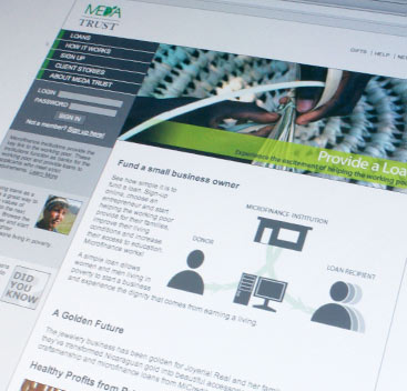
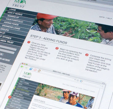
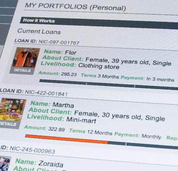
We worked together with MEDA to develop MEDATrust.org. The web site allows the donor to set up a portfolio, invest a specific amount of money and fund entrepreneurs. While we protect the identity of the entrepreneur by not disclosing their full name or photo, we are able to provide some basic information and identify the reasons they require a small business loan. The site also focuses on telling success stories of the women and men who have use microfinance loans to help build small business within their communities.
We also made it possible for groups to build collective units to invest together. Each group is a small social network where friends, often located in scattered regions world-wide, can fund a series of loans, truly seeing impact from their donations.
The site paid for itself in less than 12 months. The site has also been developed to accommodate donation matching from both pirviat and government gift matiching programs including CIDA. When the donor gives to a matched loan, the site announces the increased giving amount and the donor is able to use the additional funds increase the number of loans they support.
Visit the site for yourself, www.medatrust.org. Discover just how easy it is to engage in giving.
Direct Mail
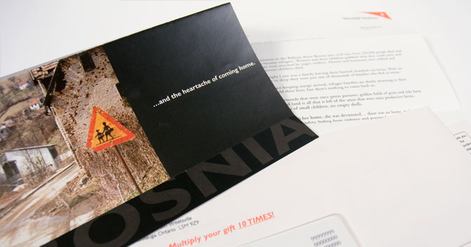
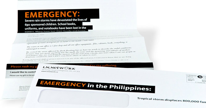
Every non-profit organization is faced with the same issue: finding supporters. Many have relied on events: dinners, auctions, runs, walks, and bikes. Strategic donor development and acquisition is extremely difficult and requires careful attention to return on investment.
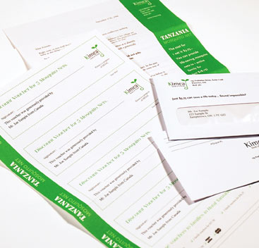
BUT when non-profits resist investment, their long-term growth stagnates. MEDA tested direct mail. While not the right approach for all organizations, direct mail was a great match for MEDA. They had a strong simple offer that was easily explained in a short, but poignant letter. While they were not well known internationally, the letter was compelling and the need easily understood. The challenge to mailing was intensified by a board directive to mail under another organizational name that had even less brand equity than MEDA.
The direct mail acquired brand new donors at just over $160 per donor. We wanted to make sure we were able to retain a large number of these donors. The second offer we sent to them was a highly personalized package with a simple gift from the region they supported in the first mailing. The response to the second gift mailing as almost 40%! We also had several major donors identified in the mailings.
Direct mail is an important component of non-profit strategies. Without adding to the overall donor numbers, non-profit organizations will quickly lose their edge as natural attrition decreases overall donor performance.
Corporate Communication
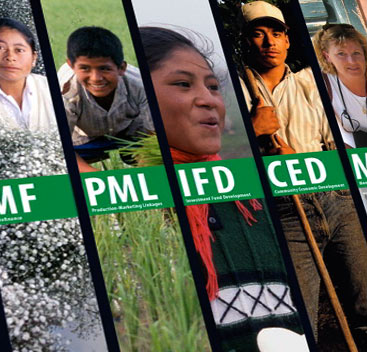
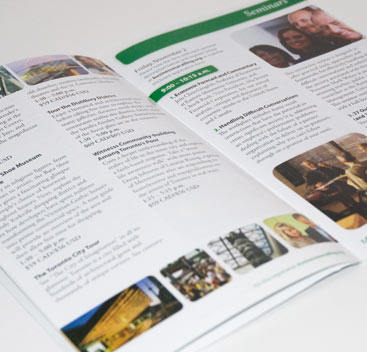
Barefoot Creative provides collateral material, like signage, displays, programs and video presentations, to augment the success of the annual convention.
Timing is critical in the production of these products. We had 45 days to complete all of the collateral for a 3 day convention. This included the strategic plan, gathering resources, copywriting, taping and producing the multi-media products and all print materials.
Working together with MEDA's convention planning team, we were able to coordinate convention collateral that was thematic and inspirational. MEDA is a microfinance and economic development non-profit organization that relies on the support of members for direction, professional insight and financial support. The excitement amongst members helps MEDA to grow and increase its program. The members attending convention left inspired by the work done and motivated by the opportunities in the future. The overall giving to MEDA increased significantly in the months following convention.
Barefoot Creative also provided an on site audio/visual technician to help with the setup and execution of the collateral elements of the convention, ensuring a smooth convention.
Video Direct Mail Package
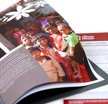
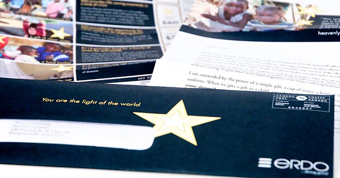
Sometimes pictures just tell the story better than words. Video can be an engaging way to increase donor's gifts; helping them see the community they are supporting in a way that they can understand the challenges. Hearing children speak for themselves or mothers identifying real needs is extremely powerful.
Sending an upgraded package to loyal donors who give annually will help increase their giving. It's important that the DVD video package is simple, and easy to use. Phoning the donors before it comes, giving them a heads up to look for the package is important. Following up with a simple phone call to answer any questions is also a good way to increase gifts.
The core package should be well designed, but not expensive. The donors don't want to think that the money for the need went into the package. On the other hand, the copy and design needs to be very easy to read and to understand, making it easy for the donor to give generously.
Annual Report
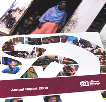
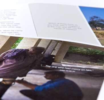
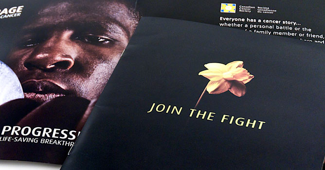
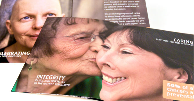
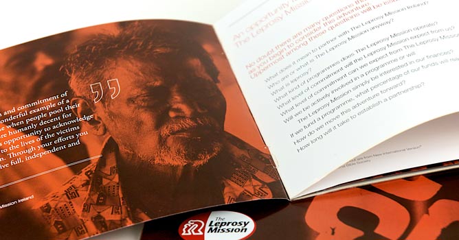
For many organizations the annual report is a corporate communication piece that is required. But the Leprosy Mission understands the power of their annual report. We developed the annual report with content that was focused on building stronger donor relationships and reaffirming the need for their support. Helping increase loyalty amongst donors, especially donors who give larger amounts.
The annual report is an excellent opportunity to illustrate financial stewardship within the context of the mission and vision of the organization. By carefully choosing stories the annual report becomes a strong communication tool to augment fund development. The annual report is a perfect document to augment proposals for foundations and government funding organizations.
The Leprosy Mission has given Barefoot Creative the opportunity to help develop their annual report for several years. We are honoured to look over the past years, working together with the senior leaders, understanding the philosophical mission, core activities and future vision. The 2009 Annual Report is a 24-page inspirational report, telling the story of the Mission in pictures stories and reports.
World Leprosy Day Campaign
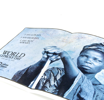
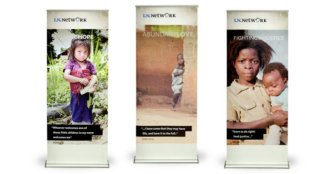
Building relationships with churches, community groups and service organizations is key to many non-profit organizations. The key to providing a successful program is simplicity and clarity. The program must be fun, interesting and engaging. The request for funds must be easy to understand and clearly related to a program or project. World Leprosy Day is internationally recognized. The Leprosy Mission Canada provides a complete program for churches. The program is clear and easy to participate with. The offer clearly integrates with the Leprosy Mission's focus on care and cure. The package includes a personalized letter to the organizer, a display poster, and inspirational pieces to be distributed to each person in the congregation. The church also receives a motivational DVD to be used at the event. Pastors and Ministers are provided sermon notes, a children's story and facts about leprosy to help them prepare for the event.
The overall goal of World Leprosy Day activities is to build relationships with churches. When they participate in an event they begin a conversation with The Leprosy Mission.
Frontline Newsletter
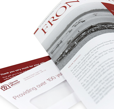
Segmenting donors is critical. Each donor segment responds to communication differently. Mass donors respond spontaneously to needs and opportunities that appeal to them. Major donors are more likely to engage with non-profits, not only funding major programs, but working together with the organization to develop effective funding models.
Middle donors (donors who give between $500 and $10,000 annually*) are systematic givers, loyal to the organization, giving 2 to 4 gifts annually. While they respond to specific programs and projects, they believe in the overall mission and vision of the organization. Unlike Major donors, they are not motivated by special treatment or personal visits. They respond well to phone calls thanking them for their donation, but prefer to remain arms length. Many middle donors don't consider themselves wealthy enough to give a large gift.
The Leprosy Mission was willing to test a unique and daring segmentation of middle donors. We worked together with them to segment middle donors into a unique mailing. While the design of the creative was simple and inexpensive, the copy was thorough and inspirational.
By using a 2 page double-sided letter in a newsletter format, we were able to use facts and information as well as a strong inspirational story. The mailing is written as a personal letter, instead of a typical newsletter format and keept very personal. This format has been extremely effective, building stronger relationships with middle donors and encouraging larger gifts.
*The definition of middle donors may vary from organization to organization. The middle donor is defined more by their activity, than their dollar amount.
Trick-or-Treat Campaign
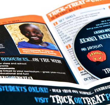
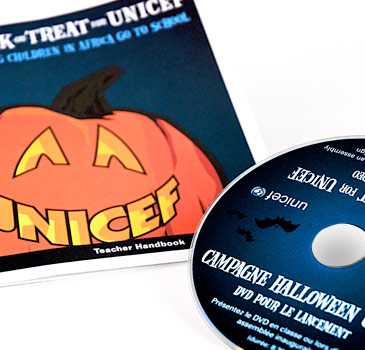
We all recognize UNICEF's Halloween boxes. Most of us have tossed in a pocketful of coins when a little ghost or goblin appeared at our door wearing one of the little orange and black boxes.
Trick-or-Treat is a tradition that has held the attention of schools and school children from more than 50 years, but in today's context, where the competition for charity campaigns within schools has increased significantly, UNICEF asked us to help develop a stronger strategic program.
It was important that we kept the essence of the program. The brand was already well known. But we needed to lift the level of participation, giving families the opportunity to impact greater change. Using the knowledge gained through UNICEF's Gift of Magic holiday giving campaign, we were able to identify appropriate giving levels and building a stronger program encouraging families to respond.
Our creative team took the found footage that UNICEF provided and created Melissa and Ian, animated school-aged children, who became the face of the program. While the core story was strongly branded with UNICEF's vision and mission, the children added interest and built a relationship with the children who participated. The creative was integrated into posters, the web site and teacher's guidelines.
Plumpy Nut Acquisition Test
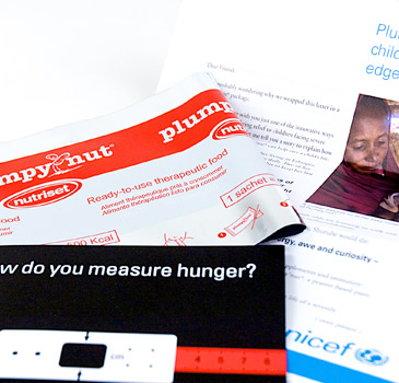
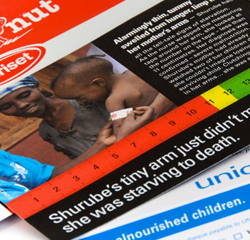
The Plumpy Nut test was inspired by the Nickel Campaign. You've likely seen it, it focuses on hunger and includes a nickel glue tipped to the letter and folded so that it shows through a window in the outer envelope. The Nickel Campaign has proven its value in healthy acquisition rates. Unfortunately, while UNICEF's label appeared on the envelope and letter, few other brand components were included.
Traditional direct mail strategists often dismiss brand as superfluous. That may be true if we are only looking to acquire one gift. Barefoot wanted to delve a little deeper into engaging donors that have a high life-time value.
We chose to use a quirky, but brand centric offer that was unique to UNICEF: Plumpy Nut. Plumpy Nut is a nutritional supplement given to malnourished babies in developing countries. The offer was simple: $25 provides 48 packages of Plumpy Nut for infants in need. One package supplies all the nutritional needs of an infant for a day. The message was strong, focused and engaging.
We used a custom designed foil envelope that mimicked the actual Plumpy Nut packaging. The outer envelope was unique and attention getting. Inside, potential donors were introduced to the need, the story and the opportunity to donate. The insert was engaging and relevant to the offer. The package also included a measurement tool that indicated malnourishment.
The Plumpy Nut mailing performed within the same target percent response against UNICEF's Nickel Campaign. But the cost of the unique package increased the cost per acquisition. Judging from the 12 week response, UNICEF decided to keep with the nickel package.
We encouraged UNICEF to track the donors longer, understanding the overall results from a donor perspective rather than a package perspective. When we extended the study to include the donor performance over 18 months, we found that the Plumpy Nut donors gave more often, more of them stayed engaged and they gave a higher amount.
Engaging donors is much more than an acquisition strategy. Using brand affinity to build a strong database with loyal donors, will increase overall results.
The Renewal Mailing
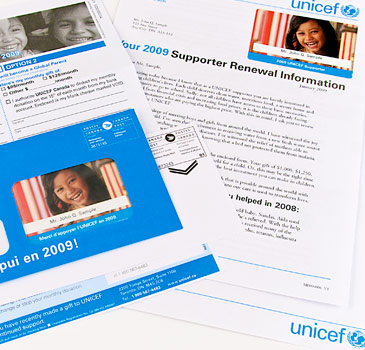
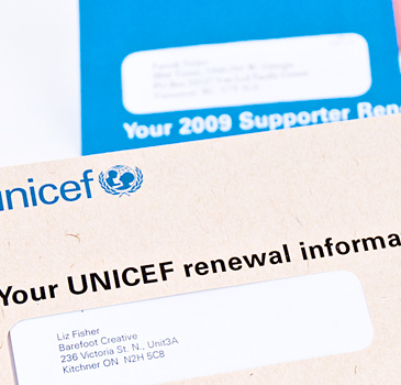
Renewing donor support is critical. Many organizations mail a donor renewal package early to mid January. This appeal package is designed to re-engage donors, some of whom have just been acquired in the past 6 months.
The renewal mailing is much more than a simple direct mail to raise funds; its inherent purpose is to build donor relationships. Our ultimate goal is for donors to feel a loyalty that inspires their annual giving.
Renewal mailings often use a personalized membership card to increase the engagement. Personalized giving statistics, healthy personal approached in the copy and strong offers all contribute to successful annual renewal offers.
We worked with UNICEF to test a three way split in their renewal mailing. The control package included a strongly personalized mailing and offers. The first test package included a personalized membership card glue tipped onto the letter. The second test used the control package copy and content, but replaced the standard outer envelope with a kraft paper envelope.
The kraft paper envelope had the strongest response rate. The membership card, while intriguing and motivating, did not have a sufficient response to account for the increase in production costs. The standard envelope failed to attract as many people. The success of the test introduced a new control package for the annual renewal mailing!
More than E-Retail
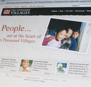
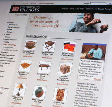
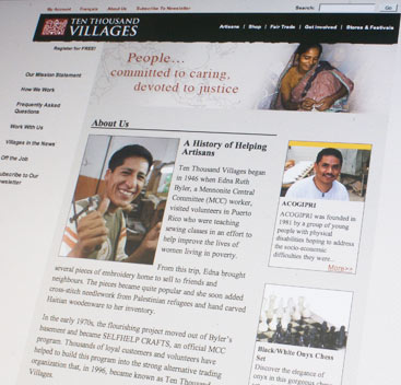
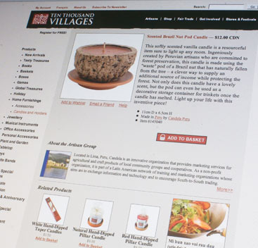
Ten Thousand Villages has a vision for change - where economic advancement impacts sustainable development. By providing a market for small businesses and artisans in areas of depressed development, the economic circumstances of the entire community can change. The foundational premise for Ten Thousand Villages is fair trade; where artisans receive a fair price for their products.
The web site faced challenges. Managers of the stores across Canada resisted an e-commerce site. Ten Thousand Villages is a destination and they did not want to deter customer from coming to the store. While they understood the increased opportunity with the web store, they also wanted to maintain a direct link to their retail stores.
The site is also much more than a store - it's founded on the story of the artisan. We designed the site to maintain the feel of coming to the store and engaging with the storytellers. We developed the e-store to be a portal to understanding the wider issues of fair trade and sustainable development, while still maintaining a strong shopping experience.
One of the challenges Ten Thousand Villages faces every day is how to manage the content it receives. Photos and stories about artisans were hidden in the bottom drawers of desks. Interesting ideas and content were stored in tattered journals of the men and women who had personally visited the suppliers overseas. The Point of Purchase system and financial database held essential information. None of this information was easily accessible to the Ten Thousand Villages team. Making sense of each piece of information, and integrating it into an engaging site posed an interesting challenge for us.
We developed an intergrated database that connects the POS, warehouse, and various other systems. This gave Ten Thousand Villages a centralized access point to product and artisan information. Using a user friendly wiki system, we were able to give multiple people the ability to create content. By adding a vetting system, the Ten Thousand Villages marketing team was able to proofread, translate and approve content easily and without cumbersome delays.
The e-store is now the hub of information, easily accessed by everyone who needs it! More than that, the e-store augments bricks and mortar, providing a retail experience for people who are unable to come to the store. Bricks and mortar stores are able to maximize their potential by using the e-store as an information resource on products and Artisans and to communicate directly to their customers, as each store has a personalized e-newsletter.
E-Newsletters
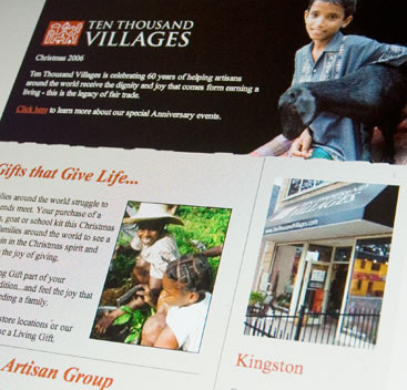
Ten Thousand Villages is focused on serving both its e-store and bricks and mortar store customers well. A monthly e-newsletter helps stores keep in touch with their customers. The e-newsletter, like Ten Thousand Villages, is much more than a retail advertisement. It includes news about Fair Trade, international recipes and products that are of special interest to the customer. While a few stores were already producing an e-flyer, the majority of the stores struggled to develop content regularly and gave up on producing an e-flyer.
The e-newsletter program our team built leveraged the vast amount of resources available on the Ten Thousand Villages wiki. Using that as a starting point, the flyer is easy to build and easy to maintain. Ten Thousand Villages central office builds a newsletter each month individual Store Managers are then able to customize the e-newsletter with products and information unique to their store. If they are unable to develop custom content, the base newsletter is sent. Maintaining regular newsletters in a timely manner is often challenging for busy store managers. The e-newsletter system gives them the ability to update their customers no matter how busy they are.
Project: Brand Development
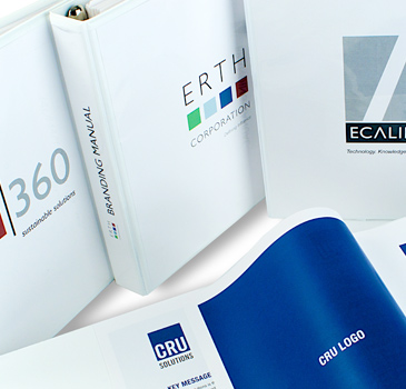
Erie Thames Power Corporation approached Barefoot Creative to assist them in building a stronger and more strategic brand presence. The corporation has grown significantly through acquisitions and had invested into several strong product and company brands. As the corporation grew, the need to understand how to profile each product under a strong brand banner was a difficult challenge.
The president challenged Barefoot to develop a strong brand strategy that would be accepted by each individual corporate vice president and the corporate board.
Barefoot Creative walked Erie Thames corporate leaders through our Big IDEAS brand development process. This process starts with finding out who the organization is, what makes it unique and how the customers experience and value that uniqueness. In this case we interviewed executives, managers and staff and then conducted a brand roundtable where leaders from the various divisions could hear first-hand the brand values of each division.
Barefoot came back to the team and recommended the development of a brand family and set about creating a unique overarching corporate brand that was connected to the various divisions. This allowed each division to cultivate their own brand while maintaining a family connection to the corporate organization.
Barefoot defined and identified a brand personality, key messaging and positioning for each division. Out of this process we then helped identify new names for each division, complete with accompanying logos and taglines. We concluded this component of the brand development process by developing complete Brand Guidelines for each division that also included the key brand elements to launch the brand.
The launch party was a celebration of each unique corporate entity. Each had a unique look and feel which echoed its function within the corporation. Yet each unique entity was strongly linked to the corporate centre, building a unified corporate look and feel.
Project: Launch Premiums
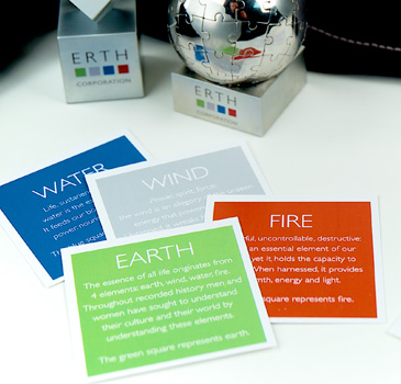
ERTH brand launch was focused on leaders and board members. The ERTH brand premium was chosen to reflect the global strength of the organization, the executive presence and brand value. Each brand segment received a unique set of branded premiums to distribute to staff members and primary suppliers to help introduce the new brand.
Staff and suppliers were excited to see the new look and feel. The family of brands increased the ability for each division to develop a strong marketing presence. But more than that, it helped the corporation understand the difference between the brand and product lines.
Project: Web Sites
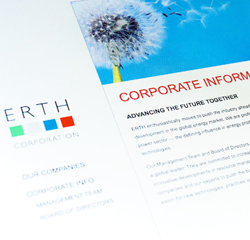
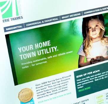
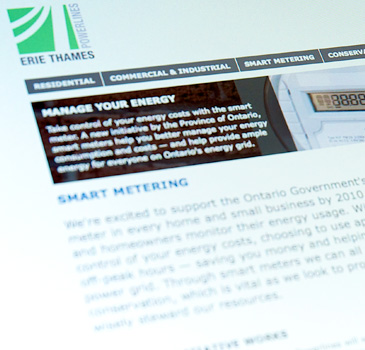
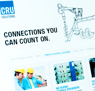
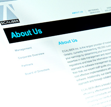
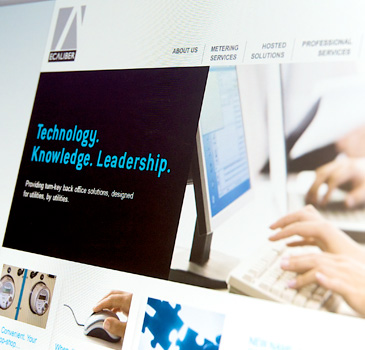
Using the new brand, key messages and product groupings, Barefoot Creative developed brand centric web sites for each company in the ERTH Corporation. The uniqueness of each brand was built into the design of the websites and provided the organization with content and visuals to help position the divisions for continued growth.
Project: Brochure
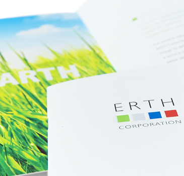
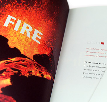
The ERTH brochure was the flagship communication tool to help set the tone for the new corporate brand and act as a launch tool for stakeholders. The bold design and strong key messaging provided a clear vision for ERTH as they continue to plan for growth in the years ahead.
Web Site
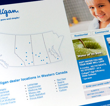
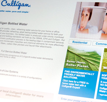
Culligan Canada came to us with a unique challenge. While their brand is well recognized, the franchise messaging across Canada was fractured. Each franchise owner prepared their own advertising and marketing material. Many had built rudimentary small web sites. Some dealers were investing in SEM, but because of the multiple Culligan web sites, they were actually competing against themselves.
The marketing and sales team clearly identified the challenges. The asked us to help them:
- Increase the brand presence of Culligan
- Increase lead generation
- Develop an integrated strategy using print and web
- Build a web environment that would honour individual regions and dealers
We partnered a professional lead oriented site and SEM campaign, with a strong sales focused direct mailer. The web site and the mailer were localized confirming to the potential customer that Culligan is a local provider. While we anticipated strong results because of the brand power Culligan already experienced, we were surprised by the strength of the sales leads.
Because of the web site redesign, focused SEM and direct mail campaigns, Culligan Canada experienced a 200% increase in lead generation.
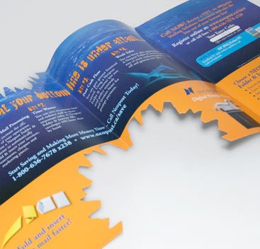
Spring Mailer
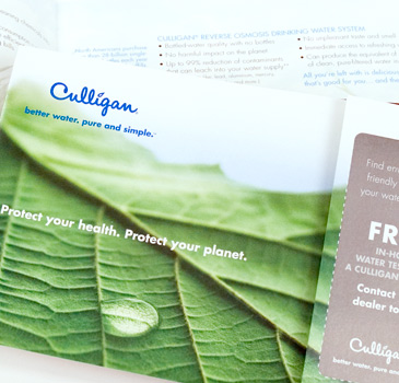
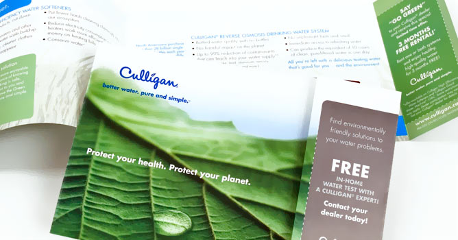
Integrated with the online web marketing strategy, the Spring mailer reinforced the online marketing efforts and provided a tangible reference as consumers researched water solutions for their homes. A fresh new creative lifted the focus from a simple product purchase to a home water solution for families that want a healthy lifestyle. Localization was critical to the success of this piece. Culligan customers look for local suppliers and resist purchases when positioned from a national centre. By developing a piece that was able to be localized for each store and franchise we were able to substantiate the Culligan's local presence.


